

Oh No—I’m Obsessed with Making Fonts
This is useless. This is wonderful.

A few years ago, I helped a friend make a font of her grandmother’s handwriting. Her references were some birthday cards and a few captions on the backs of photographs, and I constructed the font letter by letter by resizing and tracing. I recall having to make up a couple of letters that didn’t appear in any of the examples, but it worked out. Sort of.
It didn’t reeeally look natural, mostly because her writing was fast and half cursive. The letters didn’t connect or almost connect in ways that made it appear like someone was actually writing by hand, so words typed in the new font didn’t really flow.
Last week, my pal asked if I could add numbers and a few symbols that she wanted to use, so I dug back in. While I was poking around in Calligraphr (recommended, not sponsored), I stumbled upon ligatures. LIGHT BULB! Ligatures are single characters (or glyphs) made up of two or more characters. Font builder tools/sites/apps will offer big lists of common ligatures to consider, and you can add as many as you want. Ligatures can include common combos of letters (like tion, qu, st…), double letters (like, oh, the double t in letter), and letters that stumble over each other in some fonts (like fi). So when you type s and then t, the program you’re using will immediately kablammo the st ligature in its place.
So I went back in to the font template, snagged individual characters, and redrew them together in ligatures. The new and improved font is a LOT more legible. And I could go back and do even more ligatures as needed. I see some spots.
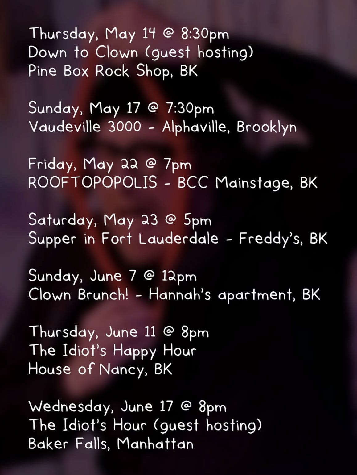
This happened here and there in a really busy week. Then… there was quiet. Three big projects went out the door all at once, and I found myself with some down time. I was putting together a social media (booooooo) post about a bunch of upcoming clown shows, and I used my old handwriting font for the information. My pal Erin messaged and asked what font it was, and I told her it was my handwriting font, but I was thinking about making a new one.
In reality, that thought occurred to me in the very moment I was typing it. BUM BUM BUUUUUM! So I hopped back into Calligraphr and drew a new handwriting font with the type of lettering I’ve been doing lately in illustrations: consonants in uppercase, vowels in lowercase (but the same size as the consonants).
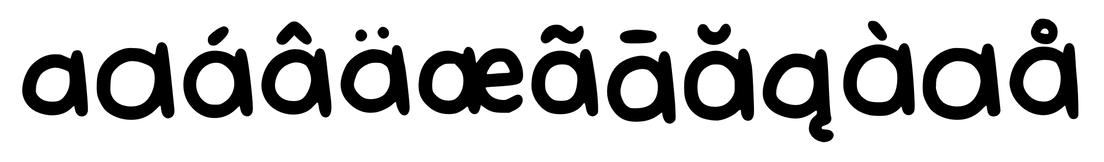
The new version of my handwriting font had nice, thick lines. And the all upper consonants and all lower vowels eliminated a necessarily different set for upper and lower case letters in the font, but I redrew all of the letters so I’d have built in variants that could make long passages look more handwritten. Theeeeen I took it further by adding actual variants of all of the letters and numbers (if you have multiple versions of the same glyph in a font, most applications will randomize them for you as you type). Theeeeeeeeeeen I took it eeeeeven further by adding ligatures. That means there are TEN versions of a, with the different cases, variants, and within ligatures, and over a dozen more when the a has an accent mark of some kind.
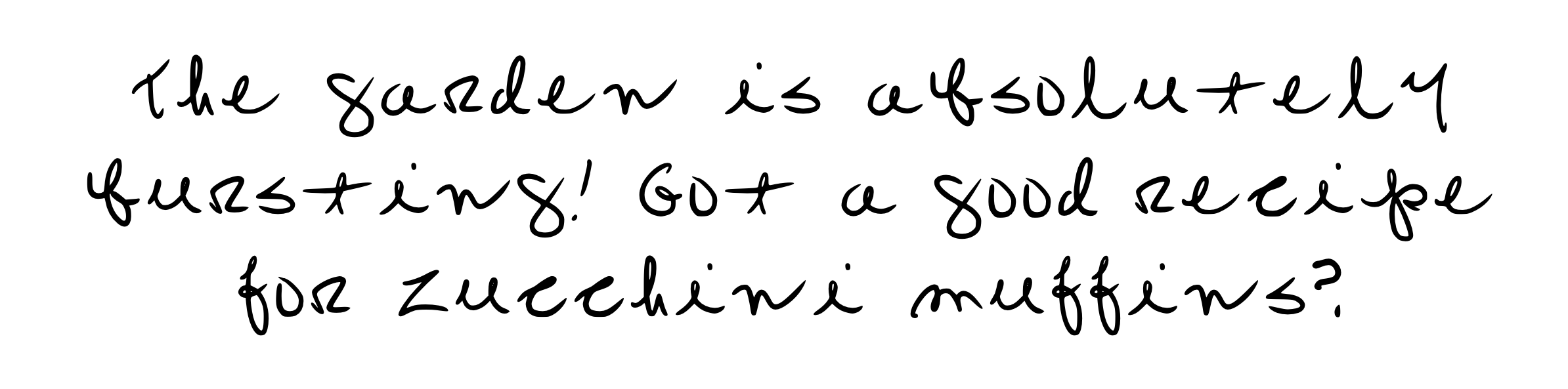
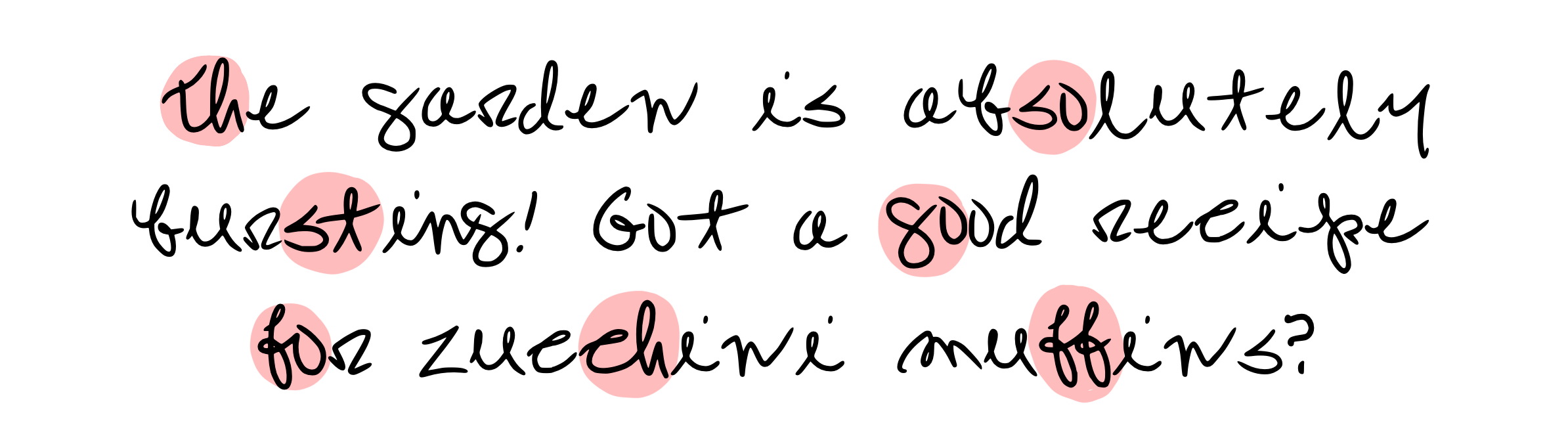
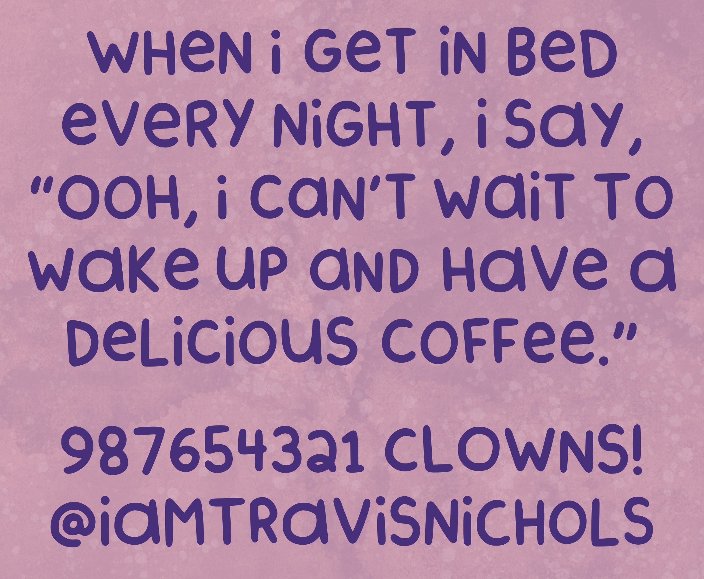
The result in a big block o’text is about as close to looking handwritten as a font can get. What’s that? You don’t believe me? Wow. After all we’ve been through? Okay, a little proof? No problem.
Wow. That was fun. So… what to do… now… I guess I could clean up the kitchen. And I really need to do laundry. Almost out of—hey, you know what all of those accent marks earlier remind me of? You know that thing on Star Trek where they go to an unknown spaceship and there’s weird writing on the control panels?
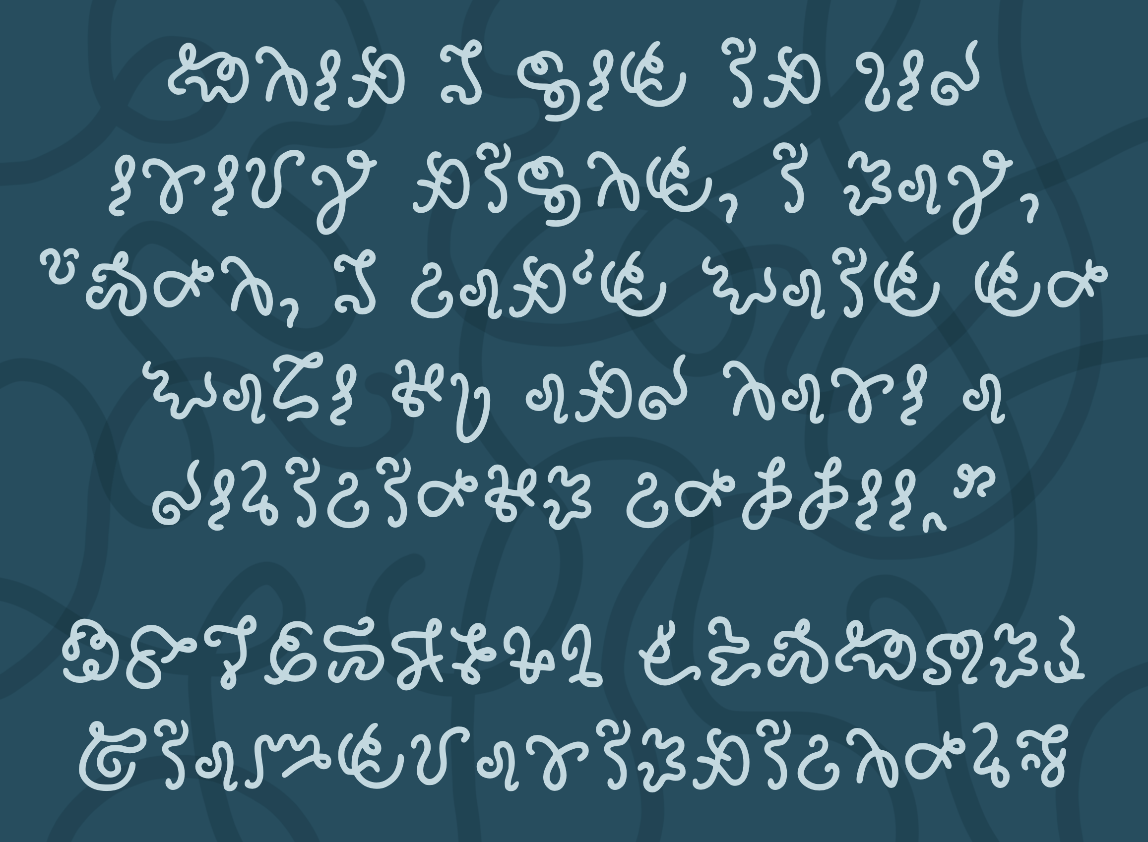
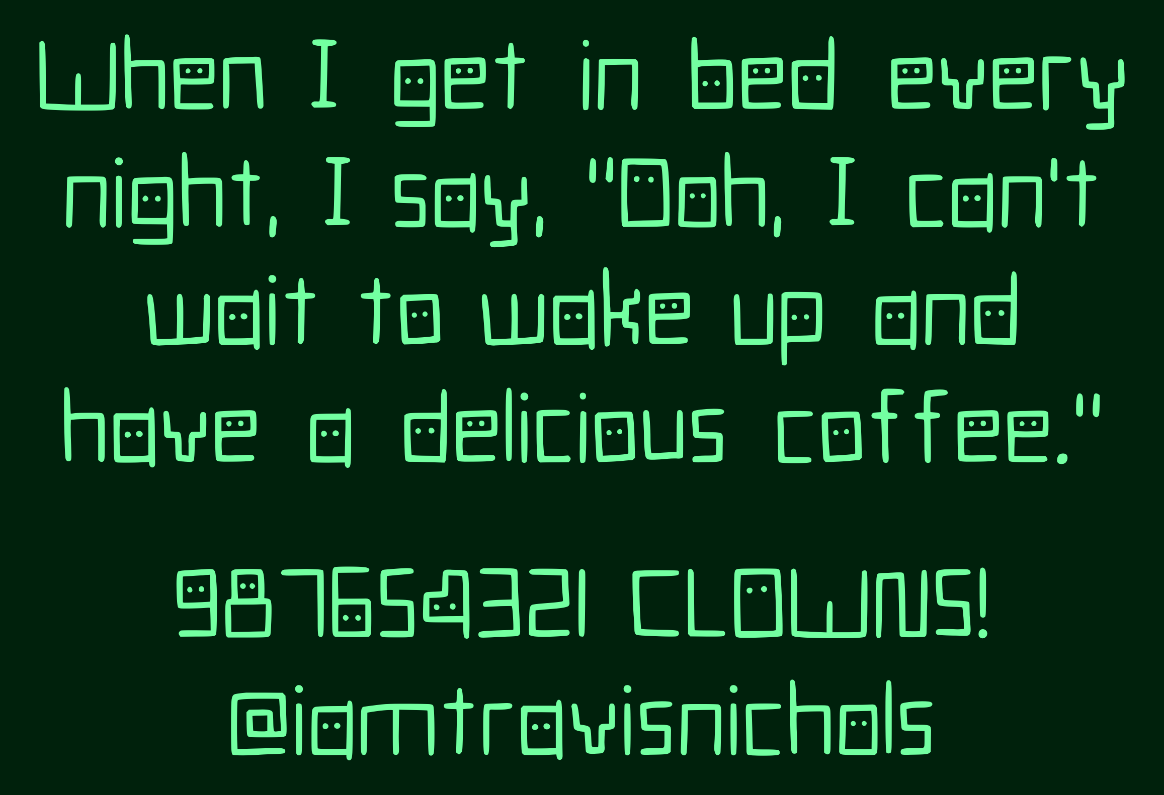
This is SQWARGLZ. It’s just flibbidyflabbidy nonsense, but sometimes a squiggle looks a little like the letter you type to get it, but just enough that it stays confusing. It’s not meant to be read.
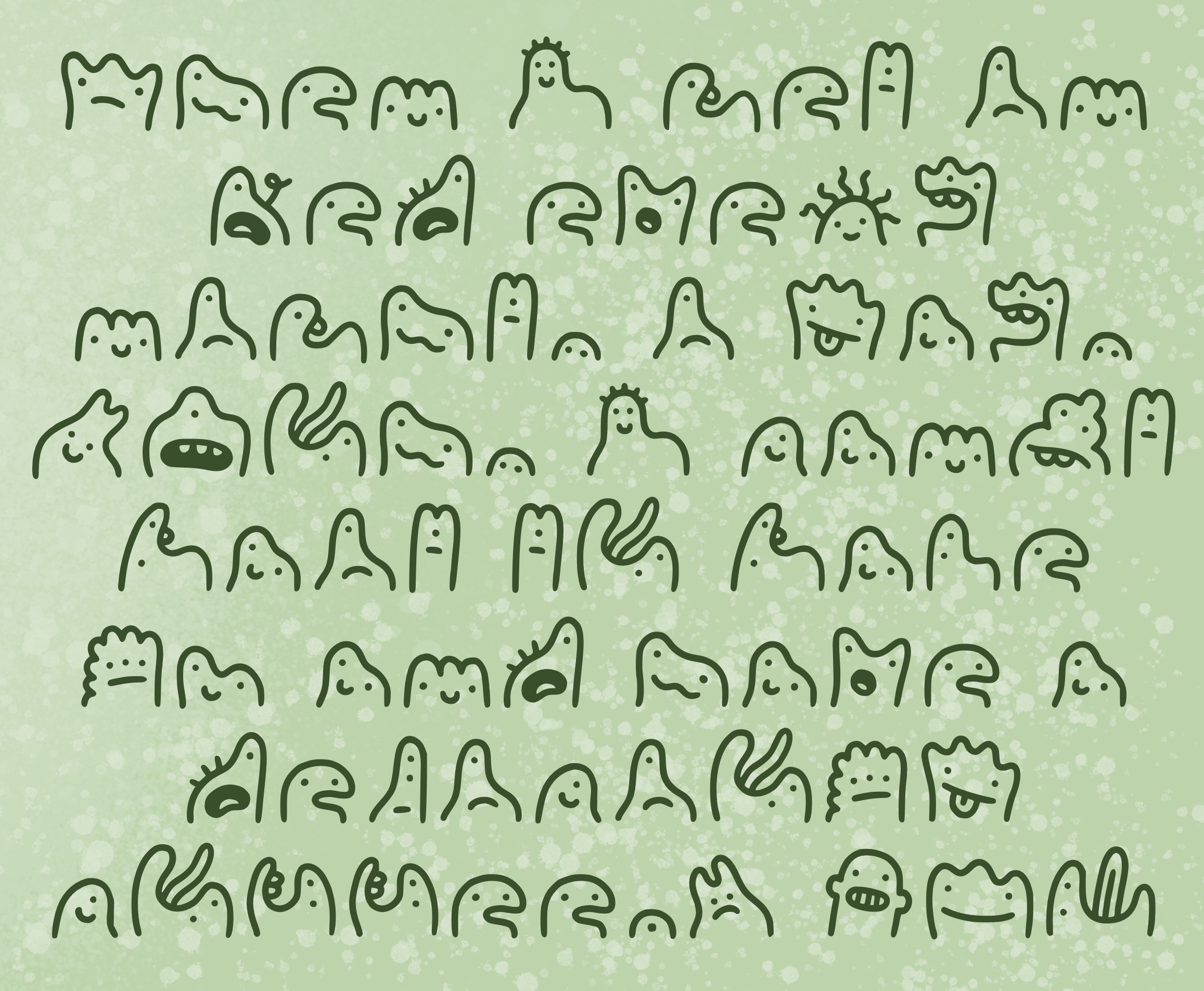
Anyway, I really should find my laundry card so I can—say, I wonder what sorts of beings might be able to read SQWARGLZ. Maybe some folks who look… like… this:
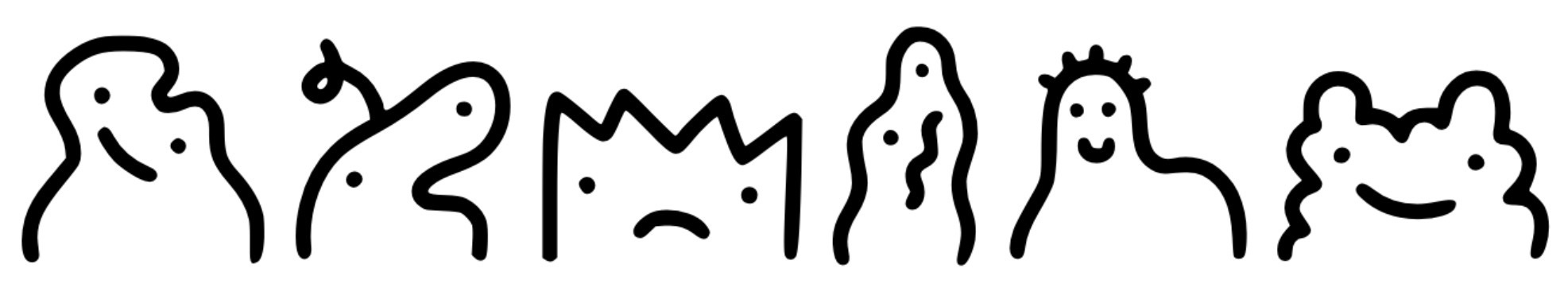
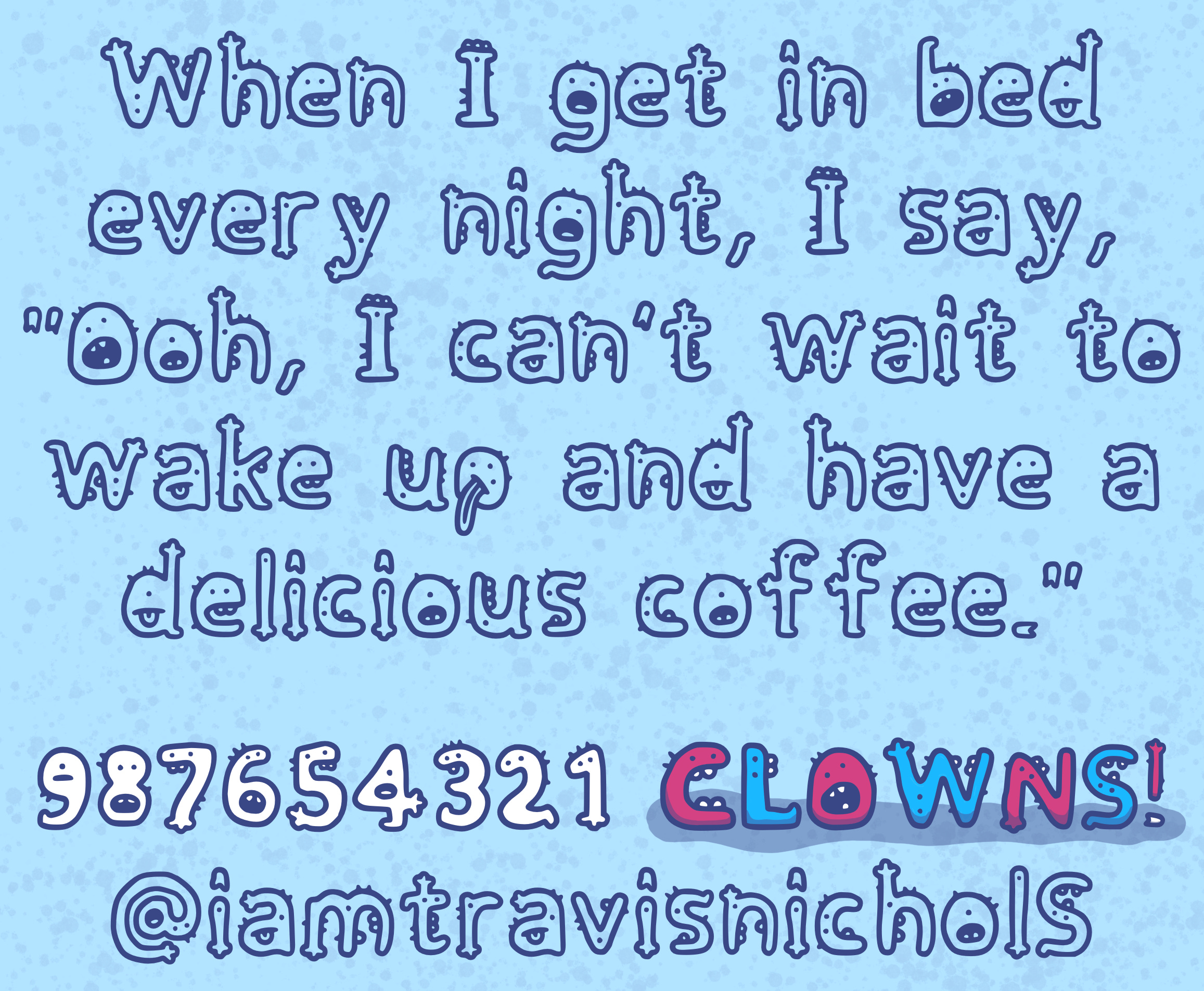
Aw. It sure is fun to draw lil’ guys. Uh… OKAY THIS FONT IS CALLED CHORDIN.
Eat it, Wingdings! But you know what… it’s cool to play with ideas at an intersection of hand-drawn and digital… and whimsical and useful. A lighthearted font that can actually be read. Anyway, here’s BOOPBORP.
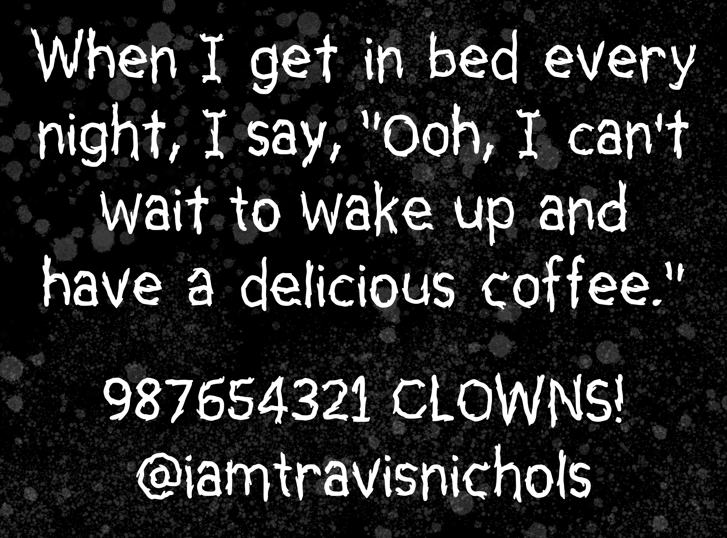
Well, that was a fun micro-hobby to have for a couple of days. Thanks for following along with me. Next time, we’ll—okay, wait. Here’s JARBLZ.
That’s not a super practical font. I get that. And I just did one that’s creature-y. I wonder if I could make something beautiful and cool… This! Is!! METALBOO!!!
I didn’t create ligatures in any of these fonts, but I made character variants for the letters on METALBOO, so apps that support it will randomize which one to use (to different degrees of success). That way it’ll look more natural when two of the same character appear in a row. Except… take a look. It used the same e over every time except for once. And it always used the same I. Couldn’t get it to mix it up. Hmm.
What now?
I don’t really know what to do with all of this. I don’t think I want to be a font person. Whatever that means. Maybe this is it. I have them now and can use them for posters or design projects. I dunno. I could put them in my shop as digital downloads. But I’d want to set up RULES and trust people to not use them for terrible things. Not that there’s much chance of BOOPBORP being used to sell weaponized drones.
But uhhh… Is this a thing? Tell me. For now it was a fun way to spend some down time (and I’m definitely not finished—I’m currently working on a font that’s all celestial stuff), but fonts are tools within tools, so there’s a pull for them to be VERY USEFUL in some way.
Want to make your own handwriting font? I really like Calligraphr. THIS IS NOT AN AD. The free version lets you build letters, numbers, and a handful of basic symbols. To get into ligatures, variants, and loads of other characters, you’ll need to have a paid account. Either way, you’ll be able to download your font as .ttf (more broadly accepted standard) and .otf (better support for variants, ligatures, and loads of characters) and use them forever and ever.
Side note that I might not know what I’m talking about regarding font formats, fonts in general, or anything in the world at all.
This is incredible! I love these!
Font making is the new heroin. I'll have a shot of JARBLZ, please!